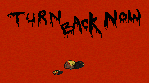
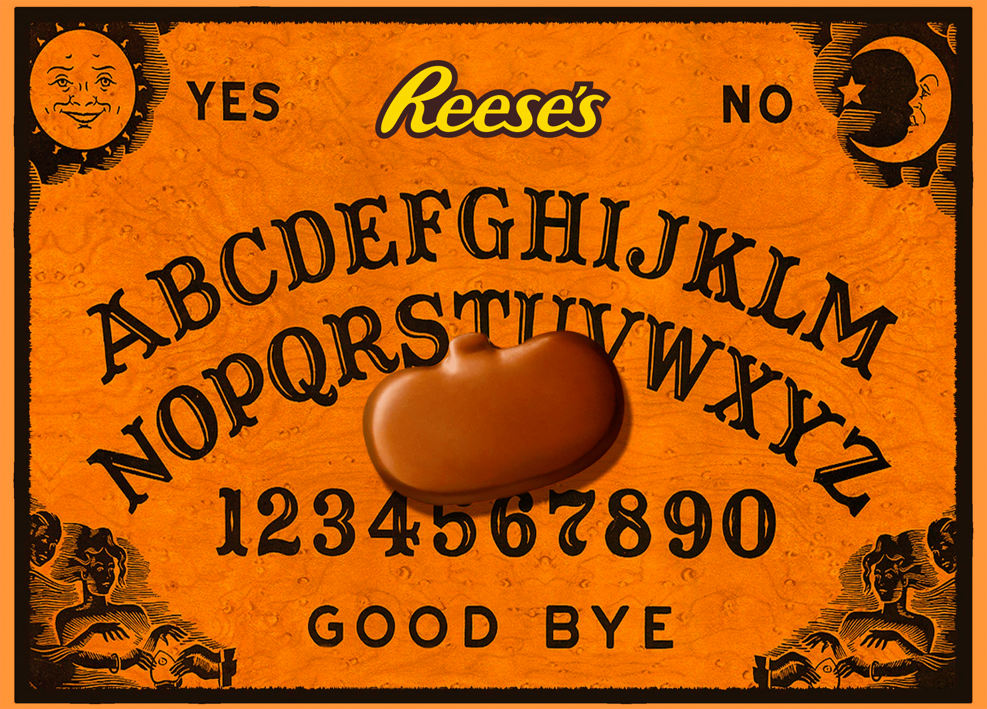
REESE’S HALLOWEEN
The Brief: Our Client asked us to make an iconic Halloween spot they could run for the next 20+ years. They wanted something simple, music-driven, and as powerful as their sister brand’s –Hershey’s KISSES– timeless ‘Bells’ holiday commercial. This was no small ask. And we delivered two of them. Both spots tested ICONIC–the highest rating in the Hershey’s system.
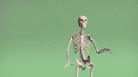
“PUMPED” :15
Creative Direction for Dentsu Creative
CD (Copy): Quentin Hirsley
Food by: The Voorhees | Neighborhood Watch
Motion by: HiFi
The Music: Though this spot is dead simple, the devil is in the details. The music is just as big of a character as the two skeletons we lovingly named Maureese and Clareese. I pushed relentlessly for a licensed track and created this Spotify playlist (below FOR YOUR ENJOYMENT) as a working document for inspiration before we aligned on Release the Beast. It’s the perfect song with some recent caché through Daft Punk sampling it. But not many people have heard the titular hook, which serves well as a call to action and a nod to the Halloween season.
We wanted to crown a new Halloween anthem and give people a break from The Monster Mash. I cut the song up, took the best pieces, and arranged them into the perfect :15 amalgamation.
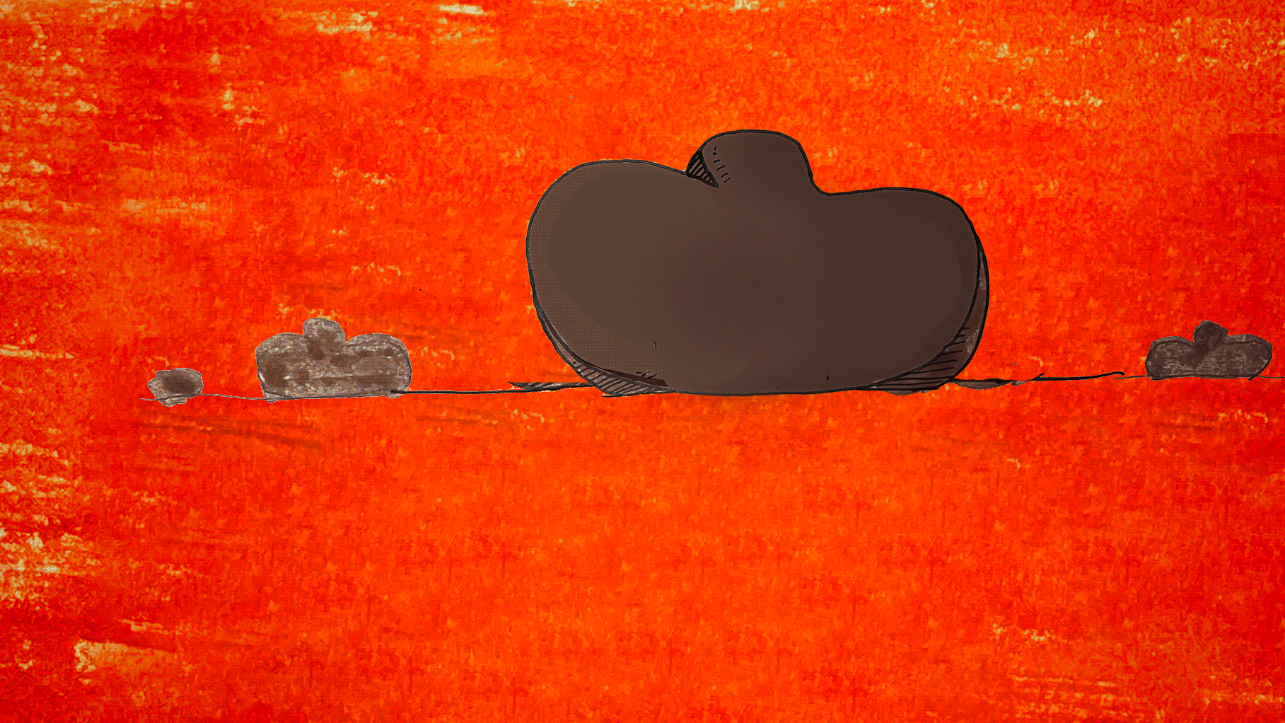
The Dance: We explored traditional animation, stop-motion, and puppetry before landing on motion capture. We cast our incredible choreographer Thom Kitt as the soul behind the skeletons. I took the best of Thom’s auditions and dance explorations, edited them together, and synced them with our clip to create the dance in the ad.

Influencer Program: Our Clients thought the dance was too fun to keep to ourselves, so we reached out to TikTok, Meta, and YouTube Shorts’ Influencers to help spread the good word.

AR Filter: We supplemented our :15 and :06 with social cut downs and even put the dance in the hands of our fans with an AR filter.
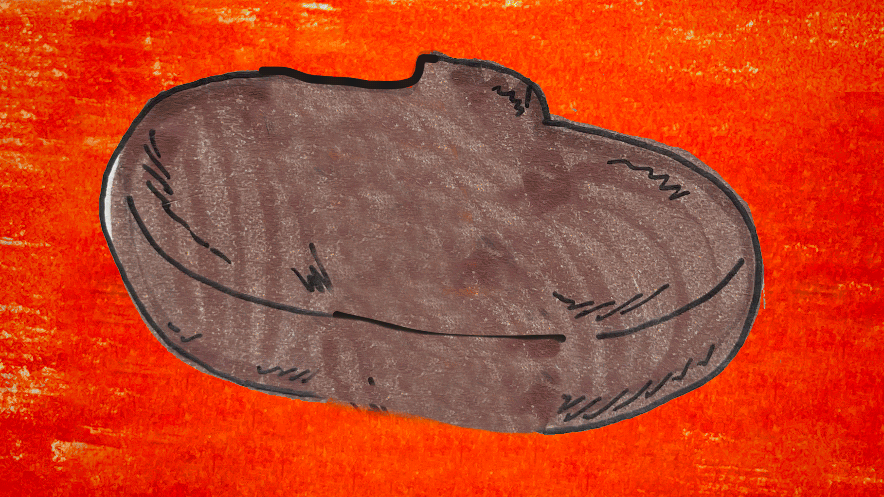
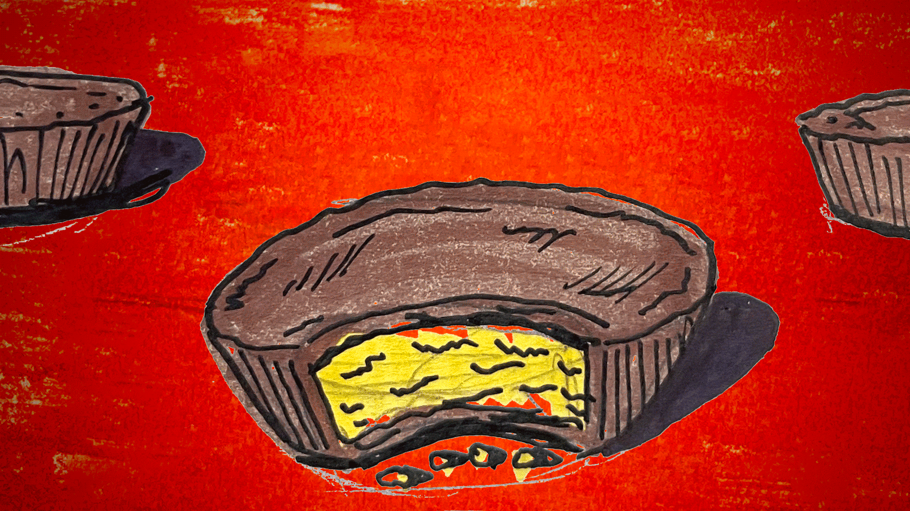
“POP GOES THE REESE’S” :15
CD (Copy): Quentin Hirsley
Production: The Voorhees | Neighborhood Watch
The Music: I found a public domain version of Pop Goes the Weasel and pitched the track down to be in a minor key as a proof of concept to this spot. From the moment my team and the Client heard the track we knew this was the beginning of something special.

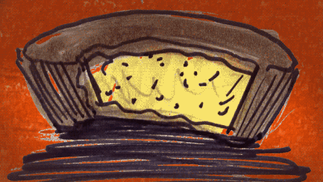
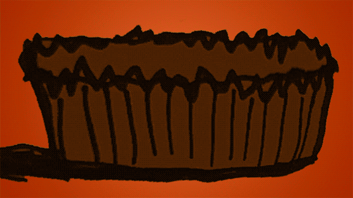
The Design: My initial storyboard sketches ended up informing the final product. Our production partners and directors, The Voorhees, took my concept art and ran with it. We wanted the ‘wooden’ exterior to mimic the iconic chocolate ridges of our cups. We wanted this thing to feel like a long-lost relic one might find in a dusty attic. I love the patina and jagged brass corners, which give the box a worn and haunting attitude. They even figured out how to, through electromagnetics, make the box work practically. No CG here. Just science!
The Process: These two spots represent the 1% of the number of concepts presented by myself and other teams. The ideation portion of the process is one of my favorite parts. And though it’s kind of sad that these ideas may never see fruition, I always have fun putting together sketches and gifs to help tell and sell the concepts.
The zoom out of the creepy baby-doll eye may go down as my favorite spot I never got to make.
Thanks for coming along with me on this spooky adventure in storytelling.